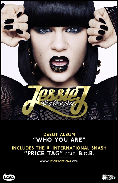
Before we collected ideas for our magazine advert we researched into other female artists adverts. We found that they all include the Album cover as the main image with the description in white and the album name/artists name either at the top or bottom of the ad.
We decided that as we had followed a lot of female popstar conventions for our other two products,
we wanted to go a less conventional route for the advert.
We decided that we would use a different picture that wasnt included in the digipak for the main photo. We also decided that this photo would not spread across the width of the ad and we central but to have it in the top right hand corner faded in. (We did this by using the erases tool mon 70% opacity in photoshop)
We then wanted the rest of the advert to be a black background for white text on top. We then had the font for the text the same as the text on the digipak to create continuity. But instead of having oit horizontal like most ads for female artists, we wanted the artists and albums name vertically placed so that it would stand out a little more and attract attention.
We noticed that on a lot of the adverts we saw there we not any star ratings or review quotes, but we wanted to include some to make our artist look popular with good reviews, which would encourage people to buy the CD.
We didnt include the release date but we did say it was 'Out Now' this means people dont have to remember a date and that they could pick the CD up as soon as posible. We also included information about the extra features on the album e.g. live performances.


No comments:
Post a Comment