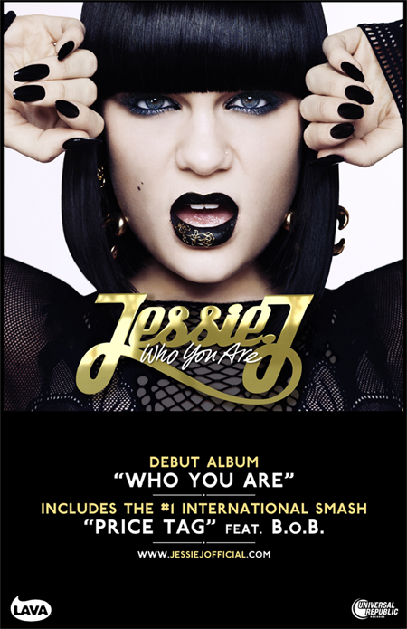
Q1: In what ways does your media product use, develop or challenge forms and conventions of real media products?
Our Music video ‘Your Love’ follows a lot of the conventions of a typical female, pop music video. I achieved this by researching and investigating into Andrew Goodwin’s theory (In terms of a music video) finding out what all/ most conventions artists follow for their music video. I alsothen watched many music videos produced by female artists such as Rihanna, Leona Lewis, Pink, Katy Perry etc so that I could get an idea of what female artists include in the video, what they wear, where its set and how they act. I found that most of the time the female is the main focus of the entire video, that costume plays a big part in making them fit the ‘ideal’of a pop star (glamorous, materialistic, stylish) and that the lyrics have a strong connection with the theme of the video. When we started planning for filming we knew that we wanted a video that would fit and follow the conventions of a music video from Goodwin’s theory. We did this because we wanted our artist to fit the ideal and seem like a realistic popstar who is similar to female singers in the charts at the moment.
-
This is a
still taken from our music video, Personally I think that the mise en scene including
the chandelier, wall paper and outfit allows our video to demonstrate the genre
characteristics. A chandelier usually represents wealth and a glamorous
lifestyle, I would also say the silver, patterned wallpaper does this. Female
artists are usually very materialistic within their videos, whether that’s in
terms of costume, location/setting or props, and with this shot we tried to
imitate this aspect of a star.
This
screen grab is taken when she sing ‘Like a flame that flickers in, come on
light my fire’ the candles allow there to be a relationship between the lyrics
and the visuals; the second point to Goodwin’s theory. By putting the candles
in a heart shape we were also able to relate the main theme of the song, love.
During most of the song we asked her to mime the words so we could lip-sync the
video to the lyrics, again reinforcing the relationship between the lyrics and
visuals, this can also be related to Goodwin’s third point of a relationship
between the music and visuals. We Cut on the beat to enable us to do this too,
mainly to make the video look professional and to make the video flow a lot
more easily.
We overlapped 2 clips, one of the light
shining on the chandelier (out of focus) and the other of our artist singing.
We changed the opacity of the chandelier layer to a low percentage while the
artist sang, and then changed it back to 100%, creating a relationship between
the music and visuals.
We again, followed Goodwin’s 4th point
of the demands of the record company including lots of close ups. We did this
not to follow the convention but to allow the audience to identify with our
artist and for her to create an image of herself. By the audience identifying
with our artist, they are more likely to connect with her/ the song therefore
making the artist more recognisable.
We tried to get our artist to hold a lot
of eye contact with the camera to create voyeurism, this is meant to make our
artist seem more attractive especially to men and let them see her as a sexual
object. Although this may not seem like a nice thing, it is a common theme
among female artists as young girls want to be more like them and men want to
see more of the artist, giving them more attention and therefore a fan base.
Some of our camera movements also help create voyeurism for example we moved
the camera along her body to show her legs and main body.
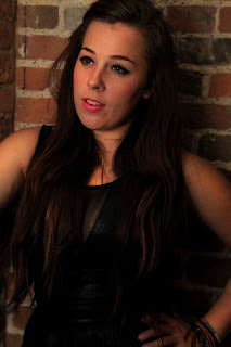
This is our Album cover photo, we
decided to follow the conventions for a female popstar album, for example
having the artist in the centre. By positioning her here the focus of the cover
is completely on her. We used quite a simple thin font for the text as we found
after researching into many female artist album covers, that this font was most
common amongst them. We used this costume for our magazine advert to create
continuity between the products, allowing her to build a star persona and also
to make her recognisable. The dress creates voyeurism and allows her to be seen
as a sexual object by men as the dress is short and puts emphasis of her chest,
which is a popular look for females.
We edited this photo into our magazine advert, we
chose this photo because we felt it represented a female star well as her whole
look in this is very glamorous e.g. her make up. We chose not to follow the
usual convention of using the album cover as the main photo because we believed
that by using a different image it would further her star image and make her
more recognisable.
The information we included on the
advert were aimed especially for young female adults, for example saying that
the CD also includes an interview with Alexa’s stylist and giving reviews from
glamour and OK magazine. This would interest readers as they would recognise
that the album would be suitable for them.
Q2: How effective is the combination of your main product and ancillary texts?
Quesion 3 : What have you learned from your audience feedback?
Q4: How did you use new media technologies in the construction and research, planning and evaluation stages?
The technologies I have used and will be discussing includes
blogger.com, final cut and Photoshop. I will talk about how to use blogger.com
to plan for a video, digipak and magazine advert, how to put together a music
video with Final cut and how to edit photos for ancillary products in
Photoshop.
To plan for my music video and ancillary products I used
blogger.com, here I was able to record all my research into artists, videos,
target audience etc. I would record this in a form of a blog post, I labelled each
post with my name and gave it a title to establish what the post would be
about. I used Blogger.com to present all my research, feedback and
progress for my music video project. It was easy to use in terms of posting new
reports on my progress and was easy to look back over work, due to its simple
layout and name tags (to differentiate posts between our group members). By being
able to see my blogging progress I was able to look back at my research
especially when it came audience feedback, so that collecting ideas was clearer
and easier, allowing us to work more efficiently and working appropriately for
our target audience.
Using Final Cut allowed me to edit all of my video clips I
had previously filmed with my group together to form the final music video.
This technology was just for the stage of creating the music video, though we
did use it for planning after we had filmed our test footage, to see how we
could edit clip together and to get an idea of how colour correcting worked. We
used certain features of final cut, for example we used the cutting tool to
shorted clips, the marker tool to mark the beat and places to edit/cut, the
fade tool and colour correct along with a few others. By using colour correct
we were able to create contrast between elements within a frame, make the
artist stand out more or just blend the background so that it was smooth. At a
few points in the video we controlled and modified the speed of a clip in final
cut, usually to make it flower, an example of when we used this was at the
point when we overlaid two clips and changed the speed of the top clip to 16%
so that it would appear less shaky and more controlled.
Photoshop is the third technology we used mainly for
creating the digipak and magazine advert, though we did also use it for
planning. We aimed to use Photoshop to edit the images we wanted to use for our
ancillary products, we tried not to edit the images too much because we wanted
the artist to look natural, also most female artists tend to be over edited. We
used the sponge tool to saturate certain colours e.g. her pink lipstick, the
dodge tool to lighten areas such as her face, the burn tool to darken areas
like the background, the text tool to add text, the spot healer tool to hide
blemishes, we also added a blur filter on our cover photo etc. Photoshop allows
you to create the look you want easily, as we have proven, though we did face
some difficulties though these only occurred during our planning for the cover
photo. I edited a few photos using tutorials online just as a tester to get an
idea of what we wanted, at times Photoshop’s layout can be confusing making it
easy to make mistakes.
All of the technologies were useful though I would say
without final cut we would not have been able to produce a video to the best of
our ability. Final cut allowed us to reach our goal of creating a successful music
video for a female artist through its easy, straightforward and clear tools and
layout. Photoshop was also essential for allowing us to edit our photos for
both the digipack and the magazine advert, it ensured that we could professionally
create the ancillary products and add the logos, text and images needed in the
right format and in the correct places. All the technologies we used were
digital though we did make notes, collect feedback and draw our storyboard
manually by hand.
Before we collected ideas for our magazine advert we researched into other female artists adverts. We found that they all include the Album cover as the main image with the description in white and the album name/artists name either at the top or bottom of the ad.
We decided that as we had followed a lot of female popstar conventions for our other two products,
we wanted to go a less conventional route for the advert.
We decided that we would use a different picture that wasnt included in the digipak for the main photo. We also decided that this photo would not spread across the width of the ad and we central but to have it in the top right hand corner faded in. (We did this by using the erases tool mon 70% opacity in photoshop)
We then wanted the rest of the advert to be a black background for white text on top. We then had the font for the text the same as the text on the digipak to create continuity. But instead of having oit horizontal like most ads for female artists, we wanted the artists and albums name vertically placed so that it would stand out a little more and attract attention.
We noticed that on a lot of the adverts we saw there we not any star ratings or review quotes, but we wanted to include some to make our artist look popular with good reviews, which would encourage people to buy the CD.
We didnt include the release date but we did say it was 'Out Now' this means people dont have to remember a date and that they could pick the CD up as soon as posible. We also included information about the extra features on the album e.g. live performances.
She represents women in a positive way, that all women stand together
........................................................................................................................................................................................................................................................................................................................
What is appealing about a female pop star?
confidence, not afraid to be themselves
.............................................................................................................................................................
What do you think a female pop star should look like?
Portrayed in a good light, not shown in a bad way
..............................................................................................................................................................................................................................................................................................
These are some answers to my questionnaire by a 17 year old girl.
In our msic video there were not many factors which could create a risk to the setting or people, but to ensure there was no harm that could be caused we carried out a few proceedures.
Candles: Using the candles was probably the element which caused most threat to health and safety, though to prevent anything from going wrong, we places a wooden mat under the sofa cover so that the candles were more stable and less likely to fall over,preventing a fire hazard. We also had a mini fire extinguisher near by taken from Anna Ts kitchen (as we were in her house) just in case there was a fire that needed to be dealt with.
Lights: When the lights are left on for a while they can heat up very quickly and could cause an injurt (burn) if touched. If we needed to move a light at any time we used a teatowel to pick the top of the light (metal part around the bulb) up or to position it.
Wires: As there were lots of wires on the the floor, due to lights and speakers/ laptop we ensured that there was little/ no trip hazard. We did this by trying to keep the wires against the wall and reminding everyone to be careful and look out for wires as they walked.
Copyright refers to laws that regulate the use of the work of a creator, such as an artist or author. This includes copying, distributing, altering and displaying types of work. Unless otherwise stated in a contract, the author or creator of a work retains the copyright.
It must be an original idea that is put to use. The idea alone cannot be protected by copyright. It is the physical use of that idea, such as an illustration or a written novel, that is covered under copyright law.
Our music video would have copyright meaning we would have full ownership over it.
We will target our audience by having strong images and writing. This is particually important as this is what people see when the view your album. If your presentation of it does not look good people will not be interested and will not buy it.
The style we are trying to portray is shown clearly on the front cover of ours. We have researched well into how other albums have sold well and looked at the techniques which have made it that bit better.
There has been many influences from other pop stars. For example we liked Rihanna's digipak as it was where we got some of our ideas from. We liked the close up shots of her face and then also the contrast of full body shots.
Furthermore it had a certain colour scheme which it had in all the pictures. The colour red was portrayed throughout the pictures. The colour of her hair was linked with the roses so we thought this was extremely effective.
This is an example of Rihanna's magazine advert. This is very strong as it had simple writing which states exactly what people want to know and then a powerful image of her face which encourages identification.
Throughout our time making our digipak we had to reach certain ideas and agree on certain things For example we had to decide on fonts for our front cover. This is an important decision as this is what people will see when they first look at an album. Here are some examples of the different fonts we experimented with.
With this font we tried to make the colour have a connotation with the background, the chairs.
With this one our intention was to make the lip colour the same as the font. also the colour is pink and represents a girly feel.
This one is just plain and simple and keeping it to a minimum.
In the end we decided on this font to be on the front cover:
We decided this to be it as it was edgy which suited the pop stars clothing. We liked the idea of it being simple but not too plain which is why the font is pointy and also edgy. It is also in the corner of the picture so it is not blocking out any of the image of the pop star.
In this lesson we had a template of a digipak and we had to create our own one for our artist. We had a couple of lessons to do this and also create an advert for a magazine as well.
Here are some of the photos we are using for our advert and digipak:
We particually liked this photo and decided to use it as the magazine advert as it is a close up of the top half of our pop stars body which encourages identification. It is a simple shot which we took with our own camera and lit it well and positioned her looking away from the camera and posing to make the shot seem professional.
We thought that these two shots worked well together as part of the digipak as they are strong shots which portray our pop star in different ways. The use of a extreme close up which shows highly professional detail on her face, and then the contrast of showing her whole body and a background which makes the shot much more interesting for the audience.
Researching artists similar to ours to try and find the ideal audience type.
Rihanna: Most of Rihanna's fans are young girls probably in the age range 12-19. They are into her music which is current and in the charts but Rihanna is also a huge style icon all over the world. Because her music is always in the charts, she is frequntley on the television and news so she is very well known. Other people who might be big fans of Rihanna are a male audience of all ages, probably 14+. This is because of the way she puts herself across in music videos and pictures. She
Copyright is a legal concept giving the creator of an original work exclusive rights to it. Copyright can only work if the idea/work/product is orgional and has not previously existed.
Works which have been allowed copyright by law are protected for the creators life and for 50 years after their death.
Copyright was invented/ origionated in britain after the arrival of the printing press and with wider public literacy at the beginning of fthe 18th century.
This is the copyright logo which can be placed on a product/ by a products name/ in a products information to inform people that that product is copyrighted.
Here are some of the fonts we tried out for the album text.
(
We decided not to use this one for our final image as we found the font too masculine and we didnt think the text across her stomach was the best place as we wanted her to be the main focus and by the text being placed on top of her, she is hidden along with her outfit. We felt that the factor of materialism for our artist would be lost if her clothes were unseen due to the text.
Here we wanted the text to be a similar colour to the chairs, though the text looks quite imature and unprofessional.
We liked this ones as the colour of the text matches the colour of our artists lipstick attracting attention to her lips builkding on her sex appeal and her star persona.
This is our final mage that we will be using on the front of our digipak. We chose this one because we think it looks the most perfessional and compared to other female artists album covers we thought it was the font that looked most conventional. We used a the colour white because it stands out but also doesnt destract you from the image of our artist. We positioned ot next to her head so that the artists name was apparent at first glance which helps the artist build an identity.
For our magazine advert we hope to create it as simplistic as possible. There will be a picture of our artist along side the main title. With this we will have a brief outline of what our artist is about and her music. In addition we will talk about her latest single 'Your Love' and say her inspirations and ideas beneath the track.
Underneath all that we will include critics and notes on what other magazines and people have said about the song, we also might include some 5 star rating system to make a clearer impact.
Q1: In what ways does your media product use, develop or challenge forms and conventions of real media products?
This photo uses conventions of proffessional music videos. I
think this because we used a head shot to start off with at the beginning of
the song. This is similar to real life videos as it is simple and has the
artist singing along and is a strong clear shot. Goodwin can be applied here, as one of Goodwin’s
points is showing that different music videos have their own conventions, as pop
songs mainly have the artist singing into the camera which directly addresses them to encourage
identification as it is only one person.
This shot shows the two characters in our music video.
The lighting is portrayed as the morning sun and is effective as it only lights
up parts of the face to have an impact. Another of Goodwin’s points is that
there is a relationship between lyrics and visuals. This means that the mise en
scene, shots, editing etc will match with the lyrics, like the beat of the song and instruments of the music video. The
lyrics at this particular moment refer to the man having the key to her
heart, and this shot shows the happiness of their relationship shown by the
smiles and how close the shot and framing is.
This shot is used at the end of the chorus when the
instrumental part is playing before the second verse. Applying Goodwin’s point
to do with their being a relationship between music and visuals, we thought
this shot was effective and uses the conventions of a professional music video as
it lets the audience identify with the artist. This happens by being portrayed
in a long shot which shows the female and includes the
background to encourage identification with the setting.
Another of goodwins points is that the record label will include need for close ups
of the artists to emphasise the image of the star.The reason for the use of close ups is because the
record label not only wants to advertise the song, they are also trying to
advertise the artist as well so they become well known and popular and to match
the image of the song which will intrigue the audience. In my music video I
have cut in regular close up shots of the lead singer.
This shot is a close up of hands wrapped round the males
arm and reinforces Goodwin’s point of lyrics and visuals together. We use
various close ups of the couple during our music video to show the relationship
throughout. We used bright stage lights so that it is clear to see and so the audience
can somehow relate to it. During this shot the female is also running her hands
along his arm in a stroking manner to portray affection.
This shot relates to Goodwin’s point of including close
ups of the artist to empathise the image of the star. Here we used an extreme
close up of the artists face to again encourage identification. This conveys
conventions of a typical music video by adding on top of the shot a layer. We
added this by filming a separate shot of a out of focus chandelier light and layering if on
top of the artist singing to add more effect. It dims away when she sings to empathise the meaning of the words, which is when she is talking about loving the male interest in her life.
Another of Goodwin’s points is which we have referred to earlier on is about different music videos having their
own conventions.This pop song is about love and by using a female pop star we
hope we portray this well. Also by the use of this shot which shows male hands
wrapped round her neck, this could symbolise him supporting her. This helps
add to the song’s lyrics and the meaning
This shot relates to Goodwin’s point which says that
there is a relationship between lyrics and visuals. This shot is shown right at
the end of the piece and the candles are blown out. We decided to end on this
as it is also at the beginning and we found from research and previous
experience that music videos like to have something to start and end on which are similar and have a
meaning behind them. We chose candles as they represent a strong idea of life
or love that is either alight, flickering or going out. Furthermore there is a
lyric in the song which mentions ‘flames’ and so we thought that this would
benefit us the most.
We used this picture as our album cover. This has conventions of professional music videos, for example the image of our pop star placed in the center. Having our star in the middle of the picture drags attention to her, furthermore having the background slightly blurry enhances the light on her. We have kept the front simple by keeping the title short, and simple, and keeping it to a minimum of black and white. Our star is also dressed in a way which makes her fit in with the setting, but also have an edgy feel with the use of wearing all black. The shot can be feminine though and does not take away the idea of being a female pop star by having her hair draped down one side, showing off her figure in her stance, having a low cut dress which could create materialism and wearing bright pink lipstick. All these add to the idea of portraying a feminine pop star.
Our magazine advert did not follow typical conventions as we did not have the album cover as the picture. We did this because we wanted our star to have her own identity and gain recognition. The picture of our star is brightly lit in the centre and then we have made it dimmed black round the edges. This is effective as then the focus is centered on her only. Throughout our research we found out that many female artists used simplistic writing on their advert. We decided to carry this through onto ours as it was effective and drew the audience in. We also followed conventions for magazine adverts as we carried out research and found out what other types of information to include on the advert. We added on information such as, the star ratings and the places you can purchase the album, for example amazon and hmv.
Q2: How effective is the combination of your main product and ancillary texts?
Q3: What have you learned from your audience feedback?
Feedback from the rough cut: - The lip syncing was out - The male actor was laughing and chewing gum in some scenes - Good use of shot types - The male and female actors need to be more convincing - Fill in the blank or awkward gaps - Some shots go on for too long - Good costume - Have more of a variety of setting Feedback from the final music video: - Good range of costume - Magazine advert and digipak has a good range of shot types - Lyrics match the visuals well - Improved lip syncing - Music video, magazine and digipak fit the genre - Looks really professional, especially the lighting - Some shots too long, just standing - More lip syncing - Good shots showing materialism, legs - Digipak and magazine has a good use of light and dark-contrast - Consistent style - Variety of shots-not just face but feet, hand, legs etc
Q4: How did you use new media technologies in the construction and research, planning and evaluation stages?
Final Cut
We used final cut throughout our time making our music
video. Once we had filmed all the footage we then added it all onto final cut
so we could beginthe editing. This software is very useful as it has a
timeline along the bottom with many rows where you can drag and place various
shots. There is also a preview box where you can view the footage. What we
found most useful is the markers that you can put on the tracks which enable
you to cut exactly where you want it. The play head also allows you to create a
very precise lining of a shot. There is a task bar along the side which allowed
us to cut down shots and then fulfil certain colour corrections and change the
screen size and add special effects. This has helped us shape our music video
immensely and gather the best out of our footage.
Photoshop
We used Photoshop to form our digipak cover. We created
various images which we took on one of our groups own professional camera. We lit
these shots to gather the best we could out of them. We then uploaded them on
to the computer and had to decide which ones best suited the front cover, back
cover etc. Using Photoshop we then
changed some of the shots to make them look more professional. For example on
one photo we darkened out the background as it was significantly lighter than
the others so it fitted in with the other photos. Also because it had beams showing
in the background which we did not want the public to see on the photo. In another
photo we made the background fairly blurry so that the main focus was on the
pop star. This image was used as the front cover as we thought it had the best
effect.
Blogger.com
We used this software throughout our time studying music videos. Every lesson we added information to our own blog which we were created. This enabled us to add information about our planning and progress and then finally our final product. This was beneficial as it showed how we had progressed and what we had achieved. All of us had to add individual posts and then we also wrote group posts which we sometimes did together in the lesson.


 Another of goodwins points is that the record label will include need for close ups
of the artists to emphasise the image of the star. The reason for the use of close ups is because the
record label not only wants to advertise the song, they are also trying to
advertise the artist as well so they become well known and popular and to match
the image of the song which will intrigue the audience. In my music video I
have cut in regular close up shots of the lead singer.
Another of goodwins points is that the record label will include need for close ups
of the artists to emphasise the image of the star. The reason for the use of close ups is because the
record label not only wants to advertise the song, they are also trying to
advertise the artist as well so they become well known and popular and to match
the image of the song which will intrigue the audience. In my music video I
have cut in regular close up shots of the lead singer. 

 Another of Goodwin’s points is which we have referred to earlier on is about different music videos having their
own conventions. This pop song is about love and by using a female pop star we
hope we portray this well. Also by the use of this shot which shows male hands
wrapped round her neck, this could symbolise him supporting her. This helps
add to the song’s lyrics and the meaning
Another of Goodwin’s points is which we have referred to earlier on is about different music videos having their
own conventions. This pop song is about love and by using a female pop star we
hope we portray this well. Also by the use of this shot which shows male hands
wrapped round her neck, this could symbolise him supporting her. This helps
add to the song’s lyrics and the meaning This shot relates to Goodwin’s point which says that
there is a relationship between lyrics and visuals. This shot is shown right at
the end of the piece and the candles are blown out. We decided to end on this
as it is also at the beginning and we found from research and previous
experience that music videos like to have something to start and end on which are similar and have a
meaning behind them. We chose candles as they represent a strong idea of life
or love that is either alight, flickering or going out. Furthermore there is a
lyric in the song which mentions ‘flames’ and so we thought that this would
benefit us the most.
This shot relates to Goodwin’s point which says that
there is a relationship between lyrics and visuals. This shot is shown right at
the end of the piece and the candles are blown out. We decided to end on this
as it is also at the beginning and we found from research and previous
experience that music videos like to have something to start and end on which are similar and have a
meaning behind them. We chose candles as they represent a strong idea of life
or love that is either alight, flickering or going out. Furthermore there is a
lyric in the song which mentions ‘flames’ and so we thought that this would
benefit us the most.

 We used this software throughout our time studying music videos. Every lesson we added information to our own blog which we were created. This enabled us to add information about our planning and progress and then finally our final product. This was beneficial as it showed how we had progressed and what we had achieved. All of us had to add individual posts and then we also wrote group posts which we sometimes did together in the lesson.


