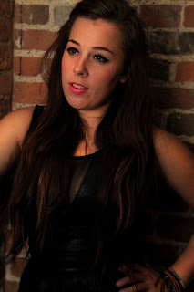
All these images show what went on when we filmed.
Showing posts with label Anna T. Show all posts
Sunday, 2 December 2012
Answers to my questionnaire
What gender are you?
male [ ]
female [ - ]
How old are you?
5-10 [ ]
11-16 [ ]
17-21 [ - ]
22-30 [ ]
31-40 [ ]
41+ [ ]
Do you like female pop stars?
yes [ - ] no [ ]
Do you like the genre of pop music?
yes [ - ] no [ ]
If not why?
...............................................................................................................................................
Who is your favorite female pop star?
Beyonce
............................................
Reason why
She represents women in a positive way, that all women stand together
........................................................................................................................................................................................................................................................................................................................
What is appealing about a female pop star?
confidence, not afraid to be themselves
.............................................................................................................................................................
What do you think a female pop star should look like?
Portrayed in a good light, not shown in a bad way
..............................................................................................................................................................................................................................................................................................
These are some answers to my questionnaire by a 17 year old girl.
Copyright
Copyright refers to laws that regulate the use of the work of a creator, such as an artist or author. This includes copying, distributing, altering and displaying types of work. Unless otherwise stated in a contract, the author or creator of a work retains the copyright.
It must be an original idea that is put to use. The idea alone cannot be protected by copyright. It is the physical use of that idea, such as an illustration or a written novel, that is covered under copyright law.
Our music video would have copyright meaning we would have full ownership over it.
Target audience - Digipak
We will target our audience by having strong images and writing. This is particually important as this is what people see when the view your album. If your presentation of it does not look good people will not be interested and will not buy it.
The style we are trying to portray is shown clearly on the front cover of ours. We have researched well into how other albums have sold well and looked at the techniques which have made it that bit better.
This is what our final front cover looked like:
The style we are trying to portray is shown clearly on the front cover of ours. We have researched well into how other albums have sold well and looked at the techniques which have made it that bit better.
This is what our final front cover looked like:
Influences for our digipak
There has been many influences from other pop stars. For example we liked Rihanna's digipak as it was where we got some of our ideas from. We liked the close up shots of her face and then also the contrast of full body shots.

Furthermore it had a certain colour scheme which it had in all the pictures. The colour red was portrayed throughout the pictures. The colour of her hair was linked with the roses so we thought this was extremely effective.

This is an example of Rihanna's magazine advert. This is very strong as it had simple writing which states exactly what people want to know and then a powerful image of her face which encourages identification.
Furthermore it had a certain colour scheme which it had in all the pictures. The colour red was portrayed throughout the pictures. The colour of her hair was linked with the roses so we thought this was extremely effective.
This is an example of Rihanna's magazine advert. This is very strong as it had simple writing which states exactly what people want to know and then a powerful image of her face which encourages identification.
Planning the digipak - Fonts
Throughout our time making our digipak we had to reach certain ideas and agree on certain things
For example we had to decide on fonts for our front cover. This is an important decision as this is what people will see when they first look at an album.
Here are some examples of the different fonts we experimented with.
For example we had to decide on fonts for our front cover. This is an important decision as this is what people will see when they first look at an album.
Here are some examples of the different fonts we experimented with.
With this font we tried to make the colour have a connotation with the background, the chairs.
With this one our intention was to make the lip colour the same as the font. also the colour is pink and represents a girly feel.
This one is just plain and simple and keeping it to a minimum.
In the end we decided on this font to be on the front cover:
We decided this to be it as it was edgy which suited the pop stars clothing. We liked the idea of it being simple but not too plain which is why the font is pointy and also edgy. It is also in the corner of the picture so it is not blocking out any of the image of the pop star.
Organizing the Digipak
In this lesson we had a template of a digipak and we had to create our own one for our artist. We had a couple of lessons to do this and also create an advert for a magazine as well.
Here are some of the photos we are using for our advert and digipak:
We particually liked this photo and decided to use it as the magazine advert as it is a close up of the top half of our pop stars body which encourages identification. It is a simple shot which we took with our own camera and lit it well and positioned her looking away from the camera and posing to make the shot seem professional.
We thought that these two shots worked well together as part of the digipak as they are strong shots which portray our pop star in different ways. The use of a extreme close up which shows highly professional detail on her face, and then the contrast of showing her whole body and a background which makes the shot much more interesting for the audience.
Here are some of the photos we are using for our advert and digipak:
We particually liked this photo and decided to use it as the magazine advert as it is a close up of the top half of our pop stars body which encourages identification. It is a simple shot which we took with our own camera and lit it well and positioned her looking away from the camera and posing to make the shot seem professional.
We thought that these two shots worked well together as part of the digipak as they are strong shots which portray our pop star in different ways. The use of a extreme close up which shows highly professional detail on her face, and then the contrast of showing her whole body and a background which makes the shot much more interesting for the audience.
Thursday, 29 November 2012
Tuesday, 27 November 2012
Sunday, 25 November 2012
Magazine advert idea
For our magazine advert we hope to create it as simplistic as possible. There will be a picture of our artist along side the main title. With this we will have a brief outline of what our artist is about and her music. In addition we will talk about her latest single 'Your Love' and say her inspirations and ideas beneath the track.
Underneath all that we will include critics and notes on what other magazines and people have said about the song, we also might include some 5 star rating system to make a clearer impact.
Final Evaluation
Q1: In what ways does your media product use, develop or challenge forms and conventions of real media products?
Another of goodwins points is that the record label will include need for close ups
of the artists to emphasise the image of the star. The reason for the use of close ups is because the
record label not only wants to advertise the song, they are also trying to
advertise the artist as well so they become well known and popular and to match
the image of the song which will intrigue the audience. In my music video I
have cut in regular close up shots of the lead singer.

Another of Goodwin’s points is which we have referred to earlier on is about different music videos having their
own conventions. This pop song is about love and by using a female pop star we
hope we portray this well. Also by the use of this shot which shows male hands
wrapped round her neck, this could symbolise him supporting her. This helps
add to the song’s lyrics and the meaning
This shot relates to Goodwin’s point which says that
there is a relationship between lyrics and visuals. This shot is shown right at
the end of the piece and the candles are blown out. We decided to end on this
as it is also at the beginning and we found from research and previous
experience that music videos like to have something to start and end on which are similar and have a
meaning behind them. We chose candles as they represent a strong idea of life
or love that is either alight, flickering or going out. Furthermore there is a
lyric in the song which mentions ‘flames’ and so we thought that this would
benefit us the most.
We used this picture as our album cover. This has conventions of professional music videos, for example the image of our pop star placed in the center. Having our star in the middle of the picture drags attention to her, furthermore having the background slightly blurry enhances the light on her. We have kept the front simple by keeping the title short, and simple, and keeping it to a minimum of black and white. Our star is also dressed in a way which makes her fit in with the setting, but also have an edgy feel with the use of wearing all black. The shot can be feminine though and does not take away the idea of being a female pop star by having her hair draped down one side, showing off her figure in her stance, having a low cut dress which could create materialism and wearing bright pink lipstick. All these add to the idea of portraying a feminine pop star.
Our magazine advert did not follow typical conventions as we did not have the album cover as the picture. We did this because we wanted our star to have her own identity and gain recognition. The picture of our star is brightly lit in the centre and then we have made it dimmed black round the edges. This is effective as then the focus is centered on her only. Throughout our research we found out that many female artists used simplistic writing on their advert. We decided to carry this through onto ours as it was effective and drew the audience in. We also followed conventions for magazine adverts as we carried out research and found out what other types of information to include on the advert. We added on information such as, the star ratings and the places you can purchase the album, for example amazon and hmv.
Q2: How effective is the combination of your main product and ancillary texts?
Feedback from the rough cut:
- The lip syncing was out
- The male actor was laughing and chewing gum in some scenes
- Good use of shot types
- The male and female actors need to be more convincing
- Fill in the blank or awkward gaps
- Some shots go on for too long
- Good costume
- Have more of a variety of setting
Feedback from the final music video:
- Good range of costume
- Magazine advert and digipak has a good range of shot types
- Lyrics match the visuals well
- Improved lip syncing
- Music video, magazine and digipak fit the genre
- Looks really professional, especially the lighting
- Some shots too long, just standing
- More lip syncing
- Good shots showing materialism, legs
- Digipak and magazine has a good use of light and dark-contrast
- Consistent style
- Variety of shots-not just face but feet, hand, legs etc
Q4: How did you use new media technologies in the construction and research, planning and evaluation stages?
Q4 conclusion - Evaluation
by: AnnaT11
This photo uses conventions of proffessional music videos. I
think this because we used a head shot to start off with at the beginning of
the song. This is similar to real life videos as it is simple and has the
artist singing along and is a strong clear shot. Goodwin can be applied here, as one of Goodwin’s
points is showing that different music videos have their own conventions, as pop
songs mainly have the artist singing into the camera which directly addresses them to encourage
identification as it is only one person.
This shot shows the two characters in our music video.
The lighting is portrayed as the morning sun and is effective as it only lights
up parts of the face to have an impact. Another of Goodwin’s points is that
there is a relationship between lyrics and visuals. This means that the mise en
scene, shots, editing etc will match with the lyrics, like the beat of the song and instruments of the music video. The
lyrics at this particular moment refer to the man having the key to her
heart, and this shot shows the happiness of their relationship shown by the
smiles and how close the shot and framing is.
This shot is used at the end of the chorus when the
instrumental part is playing before the second verse. Applying Goodwin’s point
to do with their being a relationship between music and visuals, we thought
this shot was effective and uses the conventions of a professional music video as
it lets the audience identify with the artist. This happens by being portrayed
in a long shot which shows the female and includes the
background to encourage identification with the setting.
This shot is a close up of hands wrapped round the males
arm and reinforces Goodwin’s point of lyrics and visuals together. We use
various close ups of the couple during our music video to show the relationship
throughout. We used bright stage lights so that it is clear to see and so the audience
can somehow relate to it. During this shot the female is also running her hands
along his arm in a stroking manner to portray affection.
This shot relates to Goodwin’s point of including close
ups of the artist to empathise the image of the star. Here we used an extreme
close up of the artists face to again encourage identification. This conveys
conventions of a typical music video by adding on top of the shot a layer. We
added this by filming a separate shot of a out of focus chandelier light and layering if on
top of the artist singing to add more effect. It dims away when she sings to empathise the meaning of the words, which is when she is talking about loving the male interest in her life.
Q3: What have you learned from your audience feedback?
- The lip syncing was out
- The male actor was laughing and chewing gum in some scenes
- Good use of shot types
- The male and female actors need to be more convincing
- Fill in the blank or awkward gaps
- Some shots go on for too long
- Good costume
- Have more of a variety of setting
Feedback from the final music video:
- Good range of costume
- Magazine advert and digipak has a good range of shot types
- Lyrics match the visuals well
- Improved lip syncing
- Music video, magazine and digipak fit the genre
- Looks really professional, especially the lighting
- Some shots too long, just standing
- More lip syncing
- Good shots showing materialism, legs
- Digipak and magazine has a good use of light and dark-contrast
- Consistent style
- Variety of shots-not just face but feet, hand, legs etc
Final Cut

Photoshop
We used Photoshop to form our digipak cover. We created various images which we took on one of our groups own professional camera. We lit these shots to gather the best we could out of them. We then uploaded them on to the computer and had to decide which ones best suited the front cover, back cover etc. Using Photoshop we then changed some of the shots to make them look more professional. For example on one photo we darkened out the background as it was significantly lighter than the others so it fitted in with the other photos. Also because it had beams showing in the background which we did not want the public to see on the photo. In another photo we made the background fairly blurry so that the main focus was on the pop star. This image was used as the front cover as we thought it had the best effect.
We used this software throughout our time studying music videos. Every lesson we added information to our own blog which we were created. This enabled us to add information about our planning and progress and then finally our final product. This was beneficial as it showed how we had progressed and what we had achieved. All of us had to add individual posts and then we also wrote group posts which we sometimes did together in the lesson.
We used final cut throughout our time making our music
video. Once we had filmed all the footage we then added it all onto final cut
so we could begin the editing. This software is very useful as it has a
timeline along the bottom with many rows where you can drag and place various
shots. There is also a preview box where you can view the footage. What we
found most useful is the markers that you can put on the tracks which enable
you to cut exactly where you want it. The play head also allows you to create a
very precise lining of a shot. There is a task bar along the side which allowed
us to cut down shots and then fulfil certain colour corrections and change the
screen size and add special effects. This has helped us shape our music video
immensely and gather the best out of our footage.
Photoshop
We used Photoshop to form our digipak cover. We created various images which we took on one of our groups own professional camera. We lit these shots to gather the best we could out of them. We then uploaded them on to the computer and had to decide which ones best suited the front cover, back cover etc. Using Photoshop we then changed some of the shots to make them look more professional. For example on one photo we darkened out the background as it was significantly lighter than the others so it fitted in with the other photos. Also because it had beams showing in the background which we did not want the public to see on the photo. In another photo we made the background fairly blurry so that the main focus was on the pop star. This image was used as the front cover as we thought it had the best effect.
Blogger.com
by: AnnaT11
Wednesday, 21 November 2012
Tuesday, 20 November 2012
Digipak photos
For our digipak I have been editing few photos that we can inlude.
To do this Ive bee using Photoshop CS5.1
This is the first unedited photo I opened in photoshop and these are the step I took to make it look more professional:


This is the end result, Which I think would work well inside of the digipak with songs typed on the left hand side.
This is the second photo I edited which our group thought would be good for an album cover.
To do this Ive bee using Photoshop CS5.1
This is the first unedited photo I opened in photoshop and these are the step I took to make it look more professional:
- First I duplicated the layer
- Chose filter, blur, lens blur and set the radious to 60
- On the blurred layer I selected the eraser tool and set the opacity to 100% and rubbed out the face revealing the unblurred layer beneath. For the arms and edges of the face I set the opacity to 60%
- I then used the dodge tool to lighten the face and eyes
- I used the sponge tool to bring out the colour of the lips and the colour of the iris'
- I used the spot healing tool on her cheek and head just to hide a few inperfections - this is what editors do for popstars to make them fit the ideal and look desireable


This is the end result, Which I think would work well inside of the digipak with songs typed on the left hand side.- First again I duplicated layer and cropped off the edges
- I also agian selected filter, blur, lens blur and set the radious to 30
- I then erased the blur from her body
- I used the burn tool on an opacity of 20% to darken the background
- I then set the opacity to 30% and darkened her dress and shoes
- I used the sponge tool on her hair to stand out more
- I then zoomed in on her toe nails and used the clone to make sure her red nail varnish covered her whole toe.
- Finally I changed the levels and contrast and brightness to highlight certain areas of the image and so that the image would become more striking.
Some other images I have edited:
Monday, 19 November 2012
Rough cut feedback
In our Media lesson today we received feedback from four groups who watched our video. Everyone was given a sheet and we had to rotate around the classroom to each groups computer which had their rough cut on them.
Feedback we received:
- Boy actor wasn't very convincing as chewing gum
- Some of the lip syncing was out
- The setting was quite dull
- There were long scenes where the female actor didn't do anything
Positive feedback:
- It followed music video conventions
- Choice of costume was good
- She portrayed a good star persona
Feedback we received:
- Boy actor wasn't very convincing as chewing gum
- Some of the lip syncing was out
- The setting was quite dull
- There were long scenes where the female actor didn't do anything
Positive feedback:
- It followed music video conventions
- Choice of costume was good
- She portrayed a good star persona
Thursday, 15 November 2012
Final editing lesson
In this lesson we had to finish off our editing for our music video. Each of us concentrated on helping make the work as best as we could. Throughout our time editing we have found it tricky to make all the different sections cut on the beat so we perfected this by making markers on the timeline and so it lined up exactly. We also made the lip syncing on time to ensure that our piece looked to a high professional standard. We filled in the gaps to make our piece flow all together, and then changed the framing's by zooming in on some of the shots to make them have more impact. Furthermore we colour corrected most of the shots making them look professional. For example on some of them we made the background look darker so only the main focus was on the actors and also so the audience were not able to recognize the setting. In addition in other shots, making the scene seem lighter to create a bright and happy atmosphere. By making sure that the different scenes flowed together well, we did this by adding in dissolves and fades between each one.
This is an example of us colour correcting a shot
When we had completed our music video, we invited some of our friends in to come and watch our piece to gather feedback and see what they thought of it. Overall we had very positive comments and were very pleased as they did not point out any bad parts!
Questionnaire
What gender are you?
male [ ]
female [ ]
How old are you?
5-10 [ ]
11-16 [ ]
17-21 [ ]
22-30 [ ]
31-40 [ ]
41+ [ ]
Do you like female pop stars?
yes [ ] no [ ]
Do you like the genre of pop music?
yes [ ] no [ ]
If not why?
...............................................................................................................................................
Who is your favorite female pop star?
............................................
Reason why
........................................................................................................................................................................................................................................................................................................................
What is appealing about a female pop star?
.............................................................................................................................................................
What do you think a female pop star should look like?
..............................................................................................................................................................................................................................................................................................
male [ ]
female [ ]
How old are you?
5-10 [ ]
11-16 [ ]
17-21 [ ]
22-30 [ ]
31-40 [ ]
41+ [ ]
Do you like female pop stars?
yes [ ] no [ ]
Do you like the genre of pop music?
yes [ ] no [ ]
If not why?
...............................................................................................................................................
Who is your favorite female pop star?
............................................
Reason why
........................................................................................................................................................................................................................................................................................................................
What is appealing about a female pop star?
.............................................................................................................................................................
What do you think a female pop star should look like?
..............................................................................................................................................................................................................................................................................................
Wednesday, 14 November 2012
Plan for the next few lessons
Tomorrows lesson is our last lesson to finish our music video. In that lesson we will be colour correcting all the clips filmed a month ago and a few of the newer ones, but these will be less of a priority because the lighting and colour is a lot better in them. This is because we knew what we needed to do to improve the older shots. The gold reflector means that we don’t need to colour correct any of the couple scenes, and the defuser in the shots of Bessie in the gold dress on her own mean we will need to do very little editing to the mise en scene. We will also dissolve some shots into others just to create a variety of transitions. In todays lesson we overlaid 2 clips, we may do this again towards the end of the video tomorrow (most likely the last shot of Bessie with the shot of the candles being blown out).
In Mondays lesson we will be focusing on the digipak, editing the images, adding text and putting them together. In Wednesdays lesson one of us will be finishing off the digipak and the other two will be starting the magazine advert, deciding what text to include on what image. Because we are not in college on Thursday we will have to finish our magazine advert on Monday. By this time we will have hopefully finished our digipak but if not we will be adding the final touches to it. We want to make these aspects of the final product just as good as our video because together they are worth 20 marks.
Final Stages
Tomorrow is our final deadline for the music video. We are currently fitting in a few last clips and making sure they are edited appropriately, e.g. cutting on the beat and intercutting certain clips. In the past two lesson we have added the new clips we filmed last Thursday to the first 2 and a half minutes of our video, introducing the 3 settings in the first 22 seconds (before the lyrics start). We have generally kept the order the same, though we have removed a few clips from what was shown in the rough cut and added new ones in their place. We have also added transitions to some clips, mostly fades and particularly within the first 30 seconds. We haven’t done as many fades after this time because there is more of a beat which requires sharp editing in order to fit with this. Within the first 90 seconds we have added a lot more clips of Ross and Bessie to create more of a narrative/ meaning to the video allowing the emotions of the song to be shown through the clips, this makes the artist easier to relate to and can allow the audience to build empathy for her.
We are currently working on the last minute and a half filling in all the gaps and correcting all the out of time lip syncing. By the end of the day we are hoping to have all the clips in order gaps filled so that in our final lesson tomorrow we can focus on colour correcting and perfecting transitions. We are all finding it quite stressful, as yesterday we went to ask a media teacher when the room with our work in was free, we were told it would be during our lunch but when we went to carry on editing there was a class in there. So we have had to try and fit the remainder of our work into a shorter period of time, today we are going back again at lunch because the room should be free today, we also stayed during break to finish the section we were on.
Tuesday, 13 November 2012
Story board
This is our story board we created a week before we filmed our music video. It shows the order in which we planned to order clips we were yet to take within our final edited music video.
Shot list:
Shot 1- Our artist lying on the plain sofa
shot 2- Close up on the artist, leading to her miming the lyrics to the song
shot 3- A close up on her crying in between her singing
shot 4- A pan shot of her singing sitting on the sofa
shot 5- A pan shot of her singing lying on he sofa
shot 6- A close up shot of her face miming
shot 7- Darker lighting with candles around the artist singing a verse
shot 8- A high angle of the same setting
shot 9- Close up on her face in the darkly lit setting
shot 10- A shot of the artist and a male with their heads together
shot 11- A shot of the artist and male lying on the sofa with the artist miming
shot 12- A shot of the artist and male arguing
shot 13-
Subscribe to:
Posts (Atom)